
What candlesticks mean on the chart and how to read market sentiment
Learn what candlesticks mean, how to identify trends, and read market signals. A simple guide to candlestick analysis in crypto trading.
2025-11-12
119
Authorization is required only to use the service «Team energy»
Enter the e-mail you provided during registration and we will send you instructions on how to reset your password.
An error occurred while processing your request. Please try again later. If the problem persists, please contact our support team.
Technical Analysis Patterns: what they mean, how to confirm breakouts, and where to apply them in real trading.
Prices in the market do not change without a reason. Behind every move are the decisions of thousands of participants who buy, sell, or wait for a signal to be confirmed. When actions repeat, recognizable figures appear on the chart. These technical analysis figures help you understand where the market is strengthening a move and where a reversal may begin.
Figures and patterns in trading do not provide an exact forecast, but they show the distribution of forces between buyers and sellers. The more participants notice the same regularities, the higher the probability that the market will react in a similar way.
In this article you will learn:
This material continues the series on technical analysis. If you have not read the article “Trends and Levels: How to Determine the Market Direction,” start with it to better understand the context and the structure of price movement.
A technical analysis figure shows how the price has changed and how market participants reacted to these fluctuations. When an asset enters an accumulation or correction phase, recognizable patterns appear on the chart that help you understand participants’ sentiment. Such patterns are called patterns on a cryptocurrency chart.
There are two main types of figures used in analysis:
The main condition of analysis is context. Any pattern matters only when its shape and volumes confirm market behavior. Without these signs, a pattern remains a random combination of candles that does not carry a reliable signal.
Reversal figures help identify the moment when the market is losing strength and is ready to change direction. They do not provide an exact forecast, but they show areas where supply and demand come into balance. Understanding such formations helps you spot trend weakening in time and adjust your strategy.
The most well-known reversal figures:
Head and Shoulders
This is one of the most recognizable models of technical analysis. The chart shows three peaks, with the middle one higher than the two outer ones. The lower boundary between them is called the neckline. When the price breaks it and closes below, a signal for a decline is formed. Usually volume falls during the formation of the right shoulder and rises on the breakout, which confirms the reversal. The target of the move is often calculated by the distance from the head’s peak to the neckline.
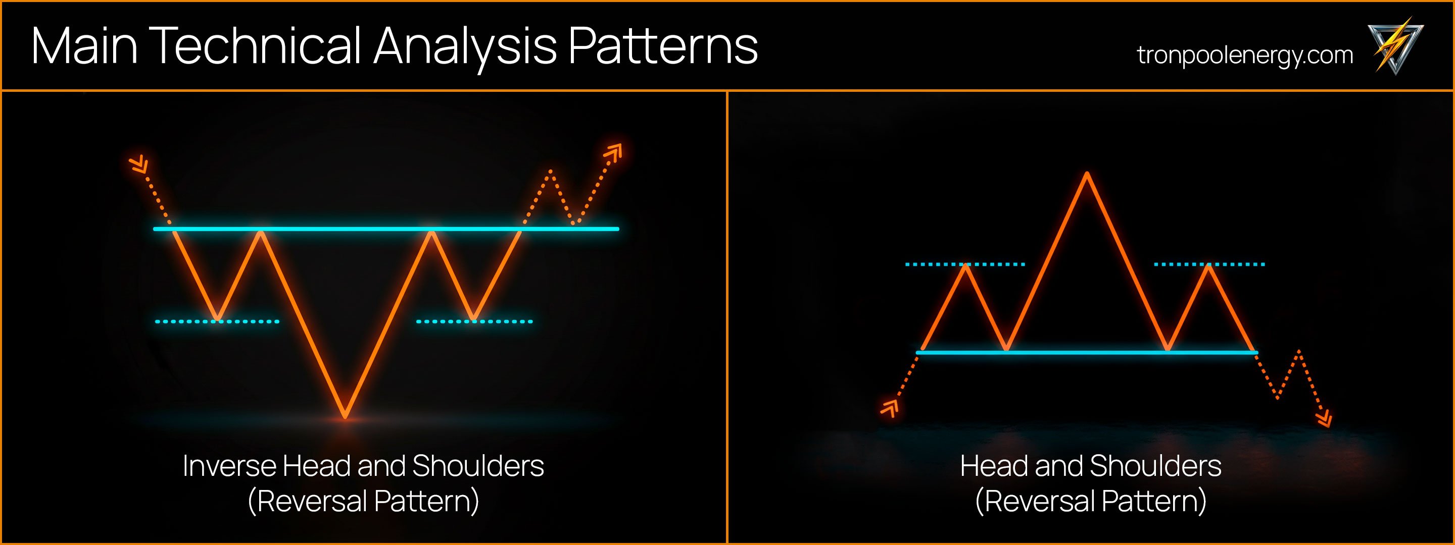
Inverse Head and Shoulders
A mirror version of the previous figure that forms at the lower part of a trend. Here there are three troughs, with the middle lower than the outer ones. When the price breaks the neckline upward with rising volumes, this is a signal of a possible start of a new upward movement. This pattern often appears after a long decline and reflects volume accumulation before a reversal.
Double Top and Double Bottom
These models form after a strong move and show failed attempts to break a level. A Double Top occurs after an advance when the price touches resistance twice and bounces down. A Double Bottom appears after a decline when the price tests support twice and starts to rise. Confirmation is a breakout of the local high or low between the touches.
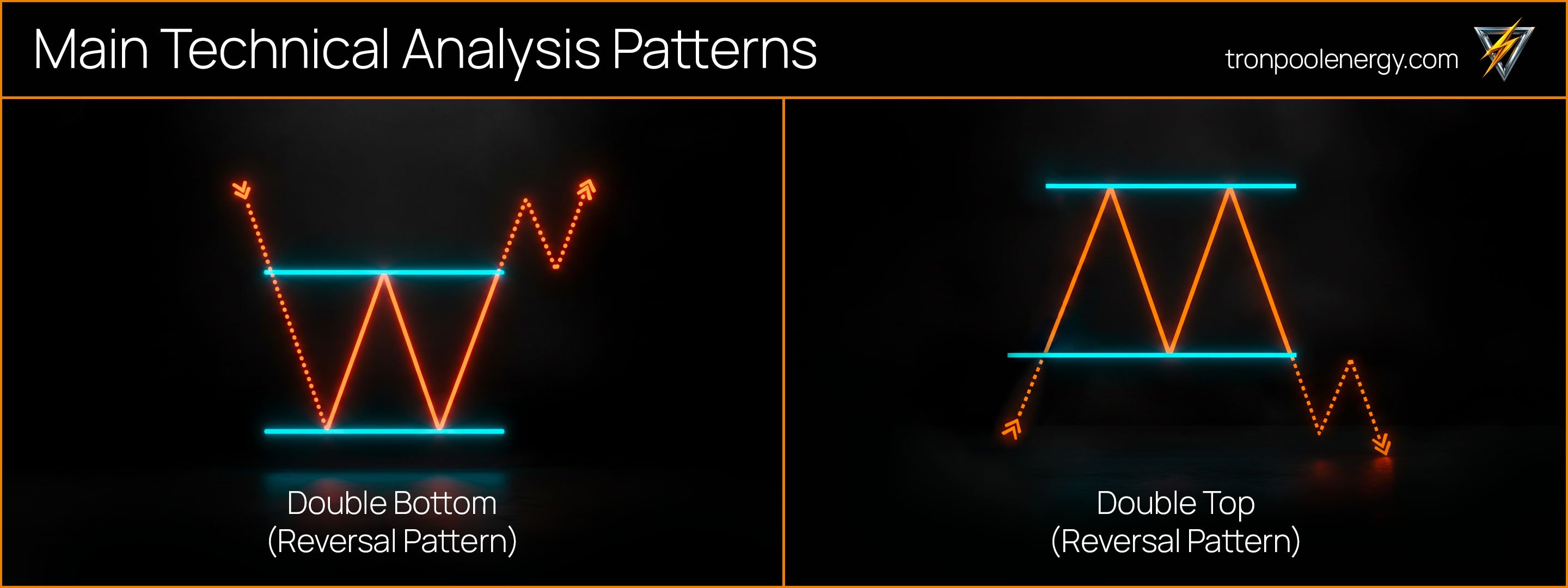
Triple Top and Triple Bottom
Rarer but more reliable patterns that strengthen the signal’s significance. A Triple Top forms when the market fails to overcome resistance three times, after which a decline follows. A Triple Bottom indicates a gradual recovery of demand. The breakout of the level is accompanied by rising volumes and confirms a shift in the trend.
These reversal figures are found on any timeframe. On daily charts they show long-term trend changes, and on minute and hourly charts—local entry points. To assess them correctly, it’s important to consider context, volumes, and interaction with support and resistance levels.
When the market temporarily slows down, it does not always mean the trend is weakening. Most often such a pause indicates that participants are taking profit, accumulating volume, and preparing for a new impulse. During this period continuation figures form, which help you understand that the move is not yet over and the market is merely gathering energy for the next step.
The main trend continuation figures:
Flag and Pennant appear after a sharp impulse when the price corrects within a narrow range. The Flag resembles a sloping channel, and the Pennant looks like a small triangle. If the breakout occurs in the direction of the previous move, the trend most often continues. These popular trading patterns are often seen on BTC, ETH, and TRX charts, where post-impulse consolidation repeats regularly.
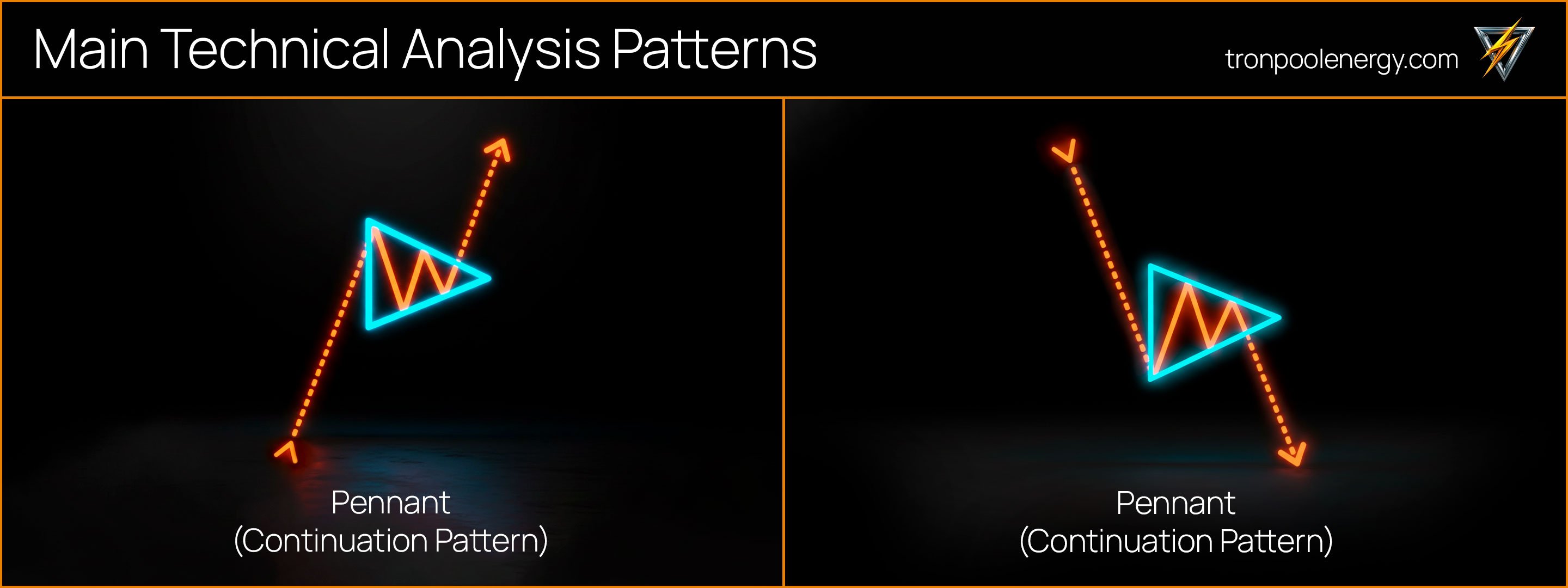
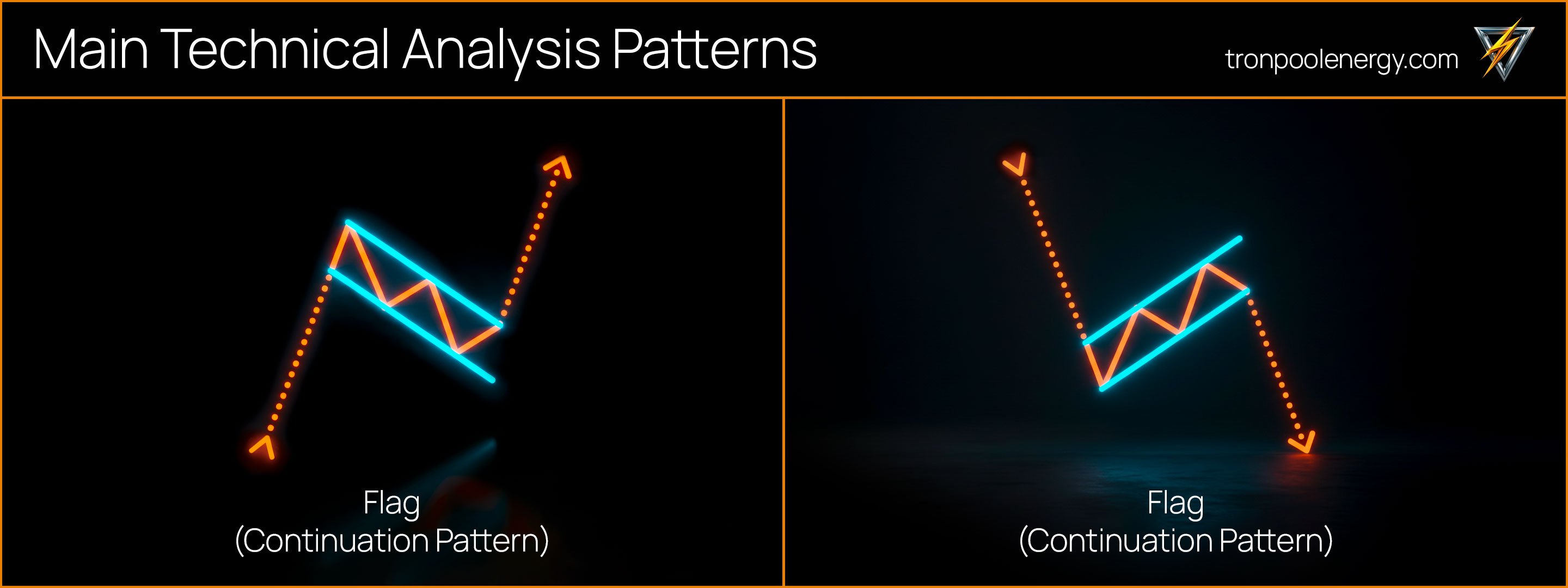
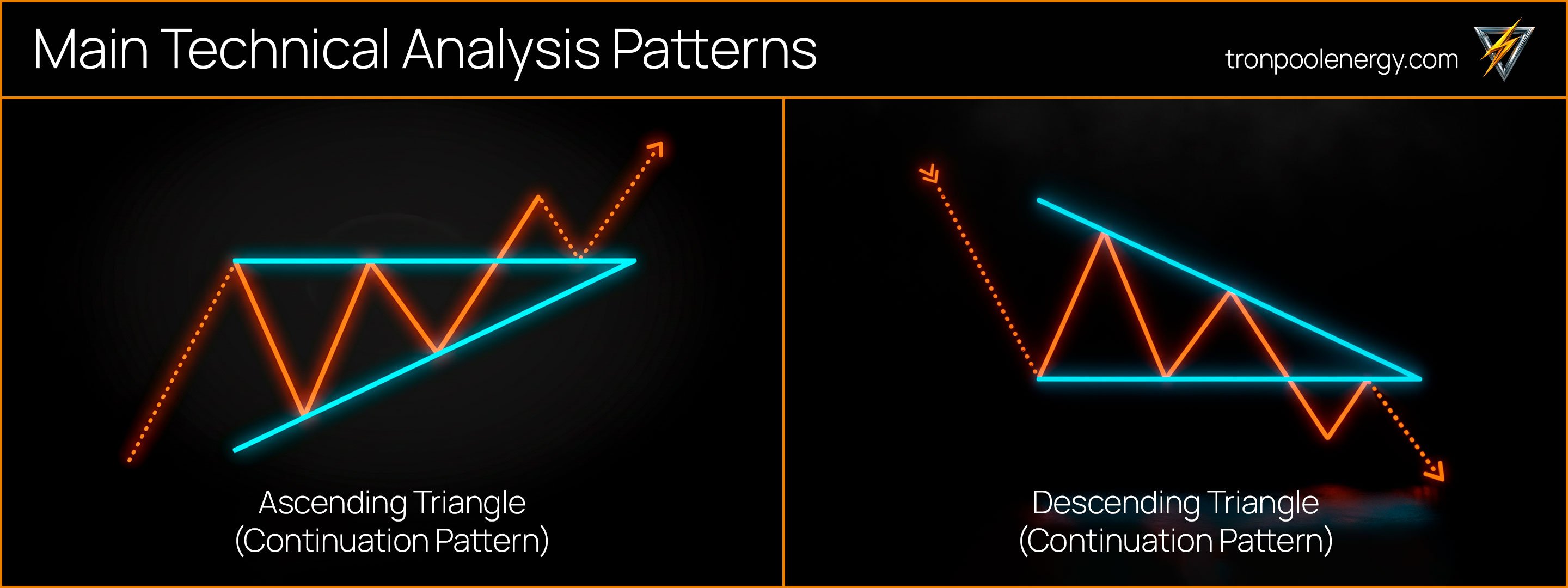
Triangle has three main types. The ascending variant shows buyer pressure when the lower boundary rises while the upper remains flat. The descending variant reflects seller advantage when the upper line drops while the lower remains stable. A symmetrical triangle forms when both boundaries converge and the market prepares to exit equilibrium.
Wedge forms on the chart at an angle to the trend. When the price leaves the wedge, the breakout often goes in the opposite direction, which makes this model useful for spotting early signals of momentum change.
These figures reflect phases of accumulation and distribution and show how the market redistributes forces before a new move. They do not provide an exact forecast, but they help you understand in which direction the trend is most likely to continue and where key levels of trader interest lie.
Beyond the classic reversal and continuation figures, charts often show smoother and more extended formations. A Rounded Bottom shows a gradual recovery of buyer interest when the price slowly stops declining and begins to form an upward move. A Rounded Top, by contrast, reflects weakening demand and a smooth transition of the market to a correction. Such patterns are most often visible on long-term charts where movement develops slowly and consistently.
A Channel is a sustained trend in which the price moves between two parallel lines. When the range is narrow and stable, traders often use a strategy of trading from one boundary to the other. A breakout of the channel up or down signals that the market is accelerating and forming a new impulse. This dynamic helps identify moments of increased participant activity.
Consolidation, also known as a range, reflects volume accumulation and a temporary pause in movement. During this period the price fluctuates within a limited range without a clear direction until a new impulse appears. After exiting the range, the market usually continues in the direction of the breakout. These figures help you understand how the market accumulates energy before the next stage and where a new wave of activity may begin.
Confirming a figure with a breakout and rising volumes helps distinguish a real trading signal from ordinary price fluctuation. Simply understanding how to identify a figure does not yet make the analysis accurate. It is important to wait for the moment when the model is confirmed by price action and market reaction.
A pattern can be considered reliable if several conditions are met:
If the price quickly returns, this is a false breakout and the signal’s strength decreases. To avoid mistakes, it is useful to check patterns using candlestick and chart patterns, as well as indicators like RSI or Moving Average. Confirming a figure with a breakout should be a mandatory element of analysis, because without it any shape remains only an assumption. When candlestick and chart signals work together, the probability of false entries decreases and the structure of movement becomes clearer.
Mistakes in pattern analysis appear when a trader relies only on templates and ignores the real state of the market. Simply memorizing a shape does not yield results if you do not consider context and volume behavior. Even the most popular trading patterns behave differently on different assets, and without confirmation from price they remain just a guess. Analysis should rely not on the external appearance of a figure but on its interaction with the trend and liquidity dynamics.
In practice the most common mistakes are:
To avoid such situations, it is worth testing each pattern on historical data and observing how it behaves in different market periods. You need to take into account the coin’s volatility, trend strength, and the instrument’s character. Regular practice helps you understand regularities and develop intuition, which over time turns into confidence and precision in decision-making.
Understanding how to use figures in trading helps connect technical analysis with real market dynamics. Chart patterns let you see not individual candles but the overall structure of price movement. They reflect where participants make decisions, where the price slows down, and where a new impulse may begin. Each figure shows human reactions—fear of losses, the desire to lock in profit, or the wish to catch the start of a move.
To apply patterns effectively, it is helpful to follow a clear sequence of actions:
This algorithm helps remove emotions and make decisions consciously. Chart figures do not promise an exact forecast, but they provide a statistical edge. When a trader combines them with context and volume analysis, trading becomes systematic and predictable, and each trade is based not on intuition but on a clear logic of market movement.
Technical analysis figures help you see the market as a living process where the interests of buyers and sellers intersect. They show moments of balance and transition when supply and demand change strength. Continuation figures reflect a pause before a new impulse, while reversal figures suggest that the dynamics have changed and the market is ready to move in the opposite direction.
The main point when working with patterns is not to try to guess the price but to carefully follow the context and wait for signal confirmation. When a trader understands the market structure and notices movement regularities, the chart begins to tell a clear story in which it is visible how each market phase is formed and develops.
The next article in the series is called: Indicators and Signals: How to Confirm Technical Analysis.
Disclaimer: The material is created for educational purposes and is not an investment recommendation.
Figures and patterns reflect recurring price movements that help you understand market sentiment. They show where participants start buying or selling and how a trend is formed. These models are used to find entry and exit points.
A reversal figure shows that the current tendency is weakening and the market may change direction. A continuation figure reflects a pause in the move before a new impulse in the same direction. Determining the type is helped by context and volume analysis.
Head and Shoulders is a model that shows a loss of trend strength. When the price breaks the neckline and holds beyond it, the market most often changes direction. The inverted version indicates a possible recovery of growth.
A figure is considered confirmed if the price confidently leaves its boundaries and is confirmed by a closing candle. At the same time volumes should rise, which shows participant interest. Without such signs the signal remains weak.
If the price quickly returns inside the pattern, the breakout is considered false. In such situations it is important not to rush and to wait for a retest of the level. Checking volumes helps distinguish a trap from a real impulse.
Figures work on short intervals as well, but signals there are less reliable. Market noise can create false formations that quickly lose strength. It is better to confirm such models with higher-timeframe charts.
Yes, patterns are applicable in crypto trading because they reflect participant behavior rather than a specific asset. They help you see regularities even with high volatility. It is important to consider volumes and the liquidity of a particular coin.